Configuration
The Stateful settings page is split up into several distinct sections, most of these sections are concerned with keying data that will be used in the watch app and to perform REST calls.
The global section contains top level fields that affect every tile or modify general app behavior in some way.

| Field | Type | Description |
|---|---|---|
| Default Index | select |
Defines which menu item is highlighted on app open |
| Open Default | bool |
Starts inside the highlighted menu item on app open |
| Per Tile Globals | bool |
Change whether Base URL and Global Headers are set globally or per tile |
| Base URL | string |
All other URL definitions in later sections have this value prepended (Visible when Per Tile Globals set to false) |
| Global Headers | Object |
Values are combined with any other header definition in later sections (Visible when Per Tile Globals set to false) |

The tile section contains fields that allow for the keying of one or more tile objects:

| Field | Type | Description |
|---|---|---|
| Tile Selection | select |
Selects which tile to edit. Also controls tile addition and deletion |
| Name | string |
The display name of the tile in app |
| Base URL | string |
URL definitions inside the scope of this tile will have this value prepended (Visible when Per Tile Globals set to true) |
| Common Headers | Object |
Values are combined with any other header definition in the scope of this tile (Visible when Per Tile Globals set to true) |
| Color | color |
The primary color of the tile |
| Highlight | color |
The secondary color of the tile |
| Icon | select |
The display icon of the tile in app |

NOTE: The
Tile Selectionfield has two special functions,Add TileandRemove Tile. On iOS the settings page must be re-opened manually after triggering each function (see iOS Known Issues).
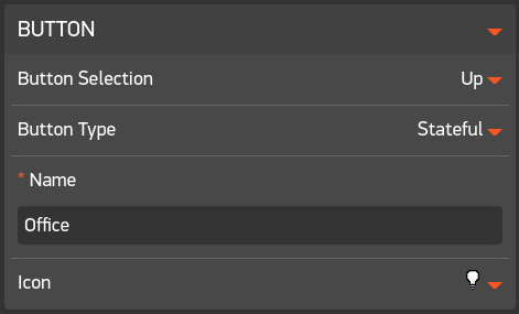
The button section contains fields that allow for the keying of 6 individual buttons per tile. Each button entry contains fields that describe how their REST call operates and how they appear in app.

| Field | Type | Description |
|---|---|---|
| Button Selection | select |
Selects which button to edit |
| Button Type | select |
Controls the type of REST call that will be made by this button (see below) |
| Name | string |
The display name of the button in app |
| Icon | select |
The display icon of the button in app |
Depending on the value of Button Type, additional sections will appear and require keying :
| Button Type | Additional Sections | Description |
|---|---|---|
| Local | Action |
Sends a HTTP request to an endpoint |
| Status Only | Status |
Sends a HTTP request to an endpoint and process response data to determine state |
| Stateful |
Action Status
|
Combines the functionality of the Local and Status Only types. Changes an endpoints state via a Local HTTP request and then processes the response data of a Status HTTP request to determine state |
| Disabled | N/A | Disables the buttons functionality |
TIP: Click a link in the
Button TypeColumn to be taken to more detailed information on each type
The action section contains fields that define a simple HTTP request. No response checking is performed, responses with a HTTP status code < 400 are assumed to have succeeded.

| Field | Type | Description |
|---|---|---|
| Method | select |
XHR Method |
| URL | string |
Partial or full url, see Base URL in the global section
|
| Headers | Object |
Optional headers to send alongside data, combined with Headers in the global section
|
| Data |
Objects[] or Object
|
One or more JSON objects to send to the endpoint |
The buttons behavior will change based on the number of JSON objects provided in the Data field:
| Number | Side Effects |
|---|---|
| 1 | None, simply calls an XHR request |
| 2 | Each JSON object will be used in a round robin fashion when index 0 fires, a green background will display on watch, when index 1 fires, a red background will display on watch |
| 3+ | Each JSON object will be used in a round robin fashion |
TIP: See Local Type in the JSON Protocol documentation for example JSON objects

The status section contains fields that define a HTTP request and how to treat the response of the HTTP request. As with the Action section, responses with a HTTP status code < 400 are assumed to have succeeded.

| Key | Expected type | Description |
|---|---|---|
| Method | select |
XHR Method |
| URL | string |
Partial or full URL, see Base URL in the global section
|
| Headers | Object |
Optional headers to send alongside data, combined with Headers in the global section
|
| Data |
Objects[] or Object
|
One or more JSON objects to send to the endpoint |
| variable | string |
A variable to extract from the response data, use dot and/or array notation to descend into a nested object |
| good | var |
If this matches the extracted Variable, display green background on watch |
| bad | var |
If this matches the extracted Variable, display red background on watch |
TIP: See Stateful Type in the JSON Protocol documentation for example JSON objects
The buttons behavior will change based on the number of elements provided in the Data field:
| Number | Side Effects |
|---|---|
| 1 | None |
| 2 | Each JSON object will be used in a round robin fashion |

The debug logging section can be used to debug the HTTP requests being made from within the application. When enabled, any HTTP logs produced in app on the back of button clicks (since last submit) will become available to view in the configuration menu.


The JSON Manager can be used to export the current tile configuration or import previously saved configuration. See JSON Protocol for detailed information on the construction of this object.
TIP: Once you are happy with your configuration, it's advisable to take a backup by copying the JSON input field out into a file

| Field | Type | Description |
|---|---|---|
| JSON | input |
A JSON representation of the currently loaded tile config, can be overwritten with backup config |
| Import | button |
Attempts to import whatever config is present in the JSON field |
The Icon manager is an experimental feature that allows for the import of external icons, extending the default list of available icons.
The specified URL must resolve to a .PNG file. The following specification is advised for best results:
| Param | Value |
|---|---|
| Width | 18 |
| Height | 18 |
| Color Type | RGBA |
| Field | Type | Description |
|---|---|---|
| Custom Icons | select |
Selects which icon to view. Also controls icon addition and deletion |
| Name | input |
A friendly name for a given icon, will appear in Icon fields in other sections |
| URL | input |
A URL that should resolve to a PNG image |
| Submit | button |
Submits a request to import the PNG file defined in the URL field |
NOTE: The
Custom Iconsfield has two special functions,Add IconandRemove Icon. On iOS the settings page must be re-opened manually after triggering each function (see the known issue).NOTE: The
Icon Managersection does not appear on Pebble Original (Aplite) devices (see the known issue).
After selecting "Add Icon" in the Custom Icons selection menu, you will be presented with a small form to fill in:
Upon submission, the settings page will close and reopen, if all went well the new icon will appear as a selectable option in all Icon fields within the settings page.