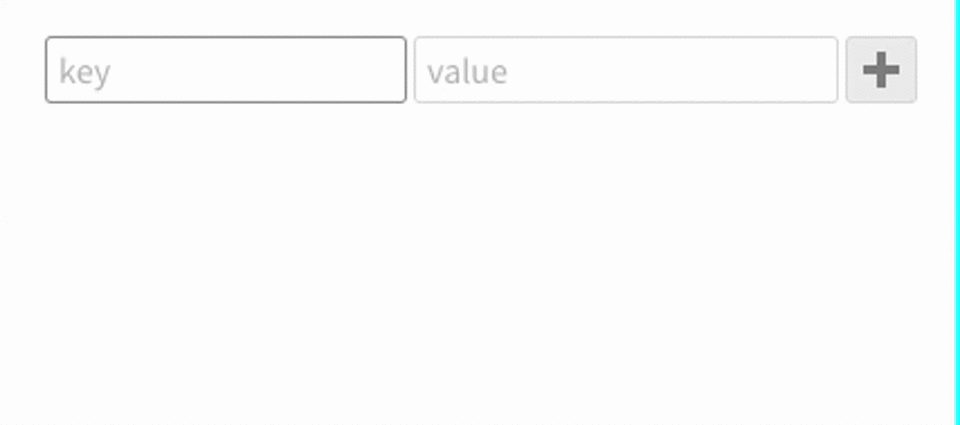
React key/value UI component.
yarnyarn start# development
yarn build
# production
yarn build:prodimport React from 'react';
import { KVEditor } from '@tag0/kveditor';
const App = () => <KVEditor />
export default App;const App = ({ darkTheme }: { darkTheme: boolean }) => {
const defaults = [
{ key: 'product', value: 'T-Shirt', options: { immutable: true } },
{ key: 'price', value: '$50.95', options: { fixed: true } },
{ key: 'link', value: 'https://www.example.org' }
];
const onChange = (values) => {
console.log(values);
};
return (
<div>
<KVEditor
defaults={defaults}
onChange={onChange}
options={{
idField: 'id',
theme: darkTheme ? 'dark' : 'light',
validateKey: new RegExp(/^[a-zA-Z0-9]*$/)
}}
/>
</div>
);
};You can run example in src/example.tsx file with yarn start.
You should copy node_modules/@tag0/kveditor/dist/icons folder to your public folder to be able to use icons.
All props are optional. You should either use defaults or rawObject. Component has internal state to keep key/value changes therefore you can use defaults only the first time.
- defaults
{ key: string; value: any; options: KVItemOptionsType }: Default values and options for the key/value editor. - rawObject
{ any }: You can pass any object into this and you would get Key/Value state automatically. - onChange
{ function }: When items added/removed/updated this method calls with items. - options
{ object }:-
idField
{ string }: If defined adds fixed and immutable key/value. If that field defined already defined it uses existing one. -
validateKey
{ RegExp }: Regular expression to validate your keys -
theme
{ 'light' | 'dark' }: You can choose betweenlightanddarkthemes -
stretchLabels
{ bool, default: true }sets all key labels to same size
-

